Thursday, 10 May 2012

Happiness and Love

Hey!
Just popping in to share a card I made ages ago but don't think I shared here... not sure why!  A bit of MME, Hero Arts and some yummy Ribbon Girl bits and pieces. :)
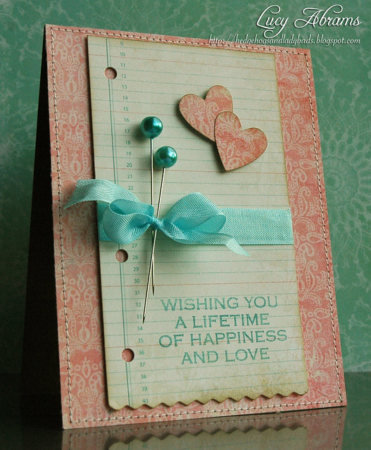
Happiness and Love
I really need to do more stamping in coloured inks - I love the effect but always seem to use black... must remember that!
Have a happy day. Back soon.
Supplies

Tuesday, 8 May 2012

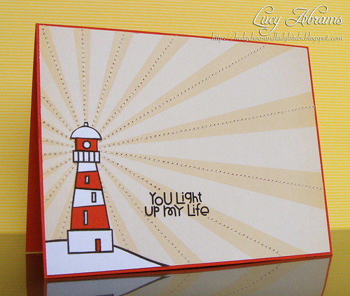
You Light up my Life

Hello, and happy Tuesday.
It was a holiday Monday here yesterday, and we had a lovely family day. :)
And I got a bit of time to create too... I decided to make a card for the new challenge over at Paper Smooches Sparks blog.  Create a card inspired by this photo:
I recently got some Paper Smooches stamps - and they are just so cute. :)  For my card, I used the Smoocheroos set, paper piecing the lighthouse onto some digi paper from Hero Arts A Day at the Circus digikit which I embellished with some simple machine stitching. Oh I do love my sewing machine. :)
DSC04139_2
Hope you get a chance to play along with this fun challenge. :)
Have a great day. x
Supplies

Saturday, 5 May 2012

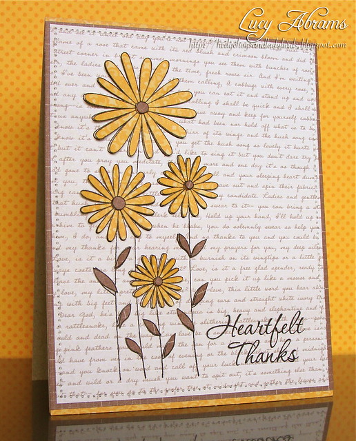
Rejection 4 - Heartfelt Thanks

Here's my next rejected card. This was for a call for paper pieced cards with a fall colour scheme. I love this Daisies stamp, and just did some simple stamping and paper piecing with Studio Calico patterned paper.  The sentiment is from THIS stamp set.
DSC04136
So why do I think it was rejected?  Perhaps it is too simple. I love making simple cards... but perhaps this one lacked embellishment... something to lift it from the page a little. Or, maybe it's the text paper in the background... does it dominate the design too much?
I'm enjoying all this analysis. :) It's making me view my designs in an entirely new, objective way. Very refreshing. :)
Have a good day.
Supplies

Friday, 4 May 2012

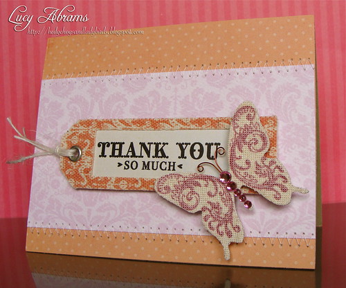
Rejection 3 - Thank You

OK, so I have another recent publication rejection to share today. This one was made to fit in with a call for cards with natural textures.  I used a gorgeous K&Co butterfly, a sweet Basic Grey canvas tag, and I printed a damask background onto watercolour paper. Loads of texture here...
DSC04138
So my thinking is that the product is not new enough. I know the magazines like their designers to use really new products and perhaps the butterfly, as the focal point of the card, was too old.  Also, in retrospect, perhaps the straight lines of the card don't fit so well with the soft nature of the fabrics.
Just my thoughts...
Anyway, this was the first card I've ever made that combined pink with orange. I was proud of myself for this new colour adventure. :)
And before I go, I've added lots of cards to my Etsy and Folksy shops. Here are a few of them... click on each card to be taken to it in the store.
More to come soon.
Until then, take care.
x

Supplies

Thursday, 3 May 2012

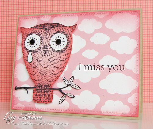
Rejection 2 - Miss You

Hello. It's time for the 2nd of my recently rejected cards. :)
Today's card was made to fit in with a call for monochromatic cards.  I love this Big Eyes Owl, and thought she might look nice in pink. I used Hero Arts cloud background from the Silly Scape digikit, recolouring it to pink and printing on rustic cardstock.
I Miss You
So, my post-submission analysis... why did I use pink???  I should have chosen blue. It would have made much more sense for a sad card. So, I've learned to think carefully about matching the colours with the theme of the card, rather than just choosing pink because I love it :)
Back soon.
x
Supplies