
Hello. It's time for the 2nd of my recently rejected cards. :)
Today's card was made to fit in with a call for monochromatic cards. I love this Big Eyes Owl, and thought she might look nice in pink. I used Hero Arts cloud background from the Silly Scape digikit, recolouring it to pink and printing on rustic cardstock.
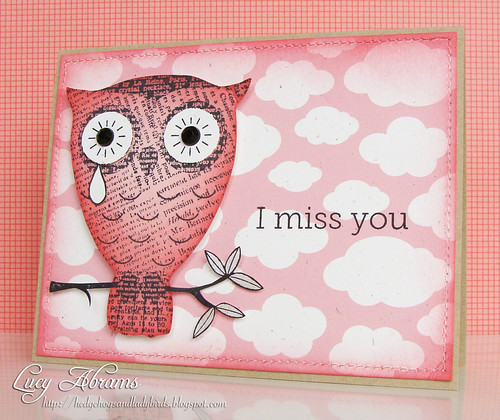
So, my post-submission analysis... why did I use pink??? I should have chosen blue. It would have made much more sense for a sad card. So, I've learned to think carefully about matching the colours with the theme of the card, rather than just choosing pink because I love it :)
Back soon.
x
Supplies
9 comments:
Lucy, this is a fantastic card. I can relate to picking pink. :) It's just such a pretty color! Beautiful!
I love it too Lucy. I could see this card in any color, green, blue, purple. It might just depend on who you are sending it to and perhaps their favorite color.
Love the pink clouds! Don't know why this one was rejected!
I still love it. It's really nice and that owl is cute :)
I ran across your card from 10/16/10 on Pinterest the other day. Is there any way to still get these owls. I couldn't find them on Hero Arts.
http://hedgehogsandladybirds.blogspot.com/2010/10/miss-you.html
Thanks for the insightful tips Lucy!
I just want to say that I get so excited to get ur blog posts. Your style is so clean and you are so creative. The things you do with the HA kits amaze me!
P.S. Pink owls are fabulous.
I think whoever picks the cards is colour blind and they should have their eyes tested - it is a gorgeous card! and obviously a girl owl - a boy wouldn't cry such a big tear,lol, hugs Mary G x
Lucy, I really love this card! Clever to add the tear drop! The pink is such a pretty colour, and I agree with Pauline, this card would work in ANY colour, it's an awesome design!
Post a Comment